Tuesday 27 December 2016

stick man animation collab

I participated in a collab hosted by a member from hyun's dojo, the collaboration was called "Comeback collab 4".  The purpose of the animation is to create two stick figures who attack each other, but the concept is that the grey stick figure is not as strong as the blue stick figure. leading in a fight that allows us to show of our ability of animating the blue stick figure to take down the grey stick figure brutely. I decided to collaborate with a online friend on this animation.

The animation was done on macromedia flash pro 8 as both my friend and I are used to the program, you can tell who animated each stick figure from the movement. My friend animated a solid reaction sequence of this grey stick figure fighting against the blue stick figure I was animating and his version of this blue stick figure (he animated the clone that came out of the first blue stick figure)

I learnt many techniques to animating with my friend, such as positioning of the stick figure to continue the fight, by this I mean making it easy for my friend to continue the movement of his stick figure and the grey stick figure when I make pose my character, the reason for this is because we are animating straight ahead instead of creating key frames as it flows better from both our experience as you will see in the example below. We only had 3 days to the deadline but with good communication and understanding of the animation, we both managed to complete the animation together. I'm surprised we got it done on time, we submitted the animation to the host of the collaboration and got accepted and will appear in the final video.

Communication was definitely a key in making this animation, as mentioned above we could have not been able to choreograph the whole fight sequence if we didn't talk to each other, I'd like to hopefully get involved with collaborating with others in the future, trying to enter competitions. I have the ability of giving a clear understanding of what I want when animating, and being able to get ideas across is essential as it is important for the animators involved to know what they could do.
Here is the final result:


and here's the full collab, our part is 6:13 into the video


Art board:


Friday 9 December 2016

study task 5 maya Expressions

moom was a fun 3D model to play with and i found him very exaggerated when posing him, i researched how animators went about posing their characters in 3D and each animator just recorded them selves doing certain poses, whereas for this study task we took pictures of ourselves to pose moom in.

It was fairly easy and i had no problem in the process of posing him, here are the results of the poses i picked, which were pain, pride, confusion, hunger, shame. i think that it turned out pretty well and resembles what i want to show but more exaggerated.


I am confident in posing moom and will be ready to pose other characters when i animate in 3D hopefully. 

weekly 10

shot 4 animating got finished

As this is the last week i have decided to get as much done as possible throughout this week because im a bit behind on my animation project, I manged to get shot 4 finished with the bus coming into the scene within the composition on after effects and timed it accordingly with easy ease key frames to receive a nice pull up of the bus coming toward the viewer.

I then moved on to my next few shots which reuse the background i had, and from this i continued to animate my character and made sure that the character starts to show that she is getting angry progressively, from a shocked face onto getting angry that she missed 2 buses.

here are some screen shots of the progressive expression;


I pretty much reused all the assets that i had made and continued to just change a few bits mostly the girls face because there was no need to animate her again and again, and from this i was able to get a lot done.

Every asset was pretty much done by half of the week and this left me with just animating her face, i was kind of annoyed that i didn't get to the scenes i planned at the end because of not planning my time wisely. but im glad that i was able to get to 30 seconds of animated content and its seems clear enough as to what is happening.

I didnt get to finish the 3 scenes after 30 seconds and continued to place my after effects final composition on to premier where i placed the recorded sounds i collected last week and placed it appropriately to sync with the sequence i created, and i am happy with the turn out.

heres a link to download the video

Thursday 8 December 2016

weekly 9

editing phone sequence after effects
This week i started with editing the different assets i made for shot 3, the assets for this scene included phone held in hand, screen and background. i started with the phone held in hand because its very easy to do which was to make a simple comp for the image sequence, after that i moved on to the screen which i had a clear idea as to what i need to do to make it work with the phone held in hand. I began with making a separate comp because there were a few more assets that had to be placed in the scene,

here is the quick flat view of the final screen result which i then need to place on to the image sequence of the phone being held in the hand:


From last week i got advice as to what i needed to do in order to place the screen onto the phone which was to make the screen 3D so that it could move around in a 3D space which allowed me to give the screen perspective which you can see from this screen shot.

All i had to do was scale it to fit the phone and key frame it so it would move with the phone. this completes shot 3,

I forgot to mention that i gather audio from last week and this week, the recordings are from my local bus stop. I recorded a few types of sound that i thought were needed for my animation, the sound of he atmosphere around the bus stop is very important because it will be playing throughout the animation and many other sounds.

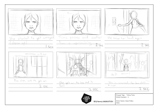
Going through the story board I could see that each shot added up to 36 seconds of animation, which is over the general amount needed for this project but the 6 seconds are important to convey the narrative I am telling and to give the comedic effects I hope to achieve.

Here's the storyboard with the timings


On Tuesday we had a group crit and we're spliced up into groups associated with what format of animation we were using which for my group was 2D digital animation, from showcasing what I had done so far in the project the group gave some advice but the most important advice was to keep at it and to finish the animation which I'm glad I had the chance to discuss about, we also talked about the sound I collected and what I could do to make it better by getting proper recording equipment and going out to a bus stop to record my sound which I'm considering.

Went back to shot 1 and finished the background so i could use it again for shot 4 because i needed to reuse the same background and continued to animate each shot, i then moved on to the bus assests and used reference of the leeds bus to create these three bus assets, front, back and side here are the assets:


Shot 2 was not done so i went back and realized that the hair was going to take time because hair movement is difficult to emulate and did take some time to do but i manged to get it done and should be ready to finish all my backgrounds next week and hopefully all the animation since ill be reusing my assets on after effects.

potentials & limitations 5

straight ahead vs key frame animation 2D animation

Both ways of animating have its potentials and limitations, which result in interesting animations,

This is all dependent on the animator themselves but you can achieve so many effects with both methods, straight ahead is a method which allows the animator create an animation from frame 1 and continue animating without using key frames. and there are potentials which can lead to making a natural sequence or either making a interesting scene that is not as accurate or proportionate. which many stick animations showcase because most of the animators animate straight ahead, heres an example of a straight ahead animation that feel natural and works:


this is really fluid and works really well and you can feel each hit from the sound effect added, most of the time its unplanned and this allows the animator to do many sequences that are not restricted by rules and storyboards.

Whereas with key frames you are limited by the fact that you cant make different movements unless you have animated in a way that there are key frames to reach and the animator can make some interesting in-between but this does not give much freedom to the animator because they are keeping to the key frames they have made, the potential of this is that the animation keeps proportion and works smoothly because you can add more in-between's where there needs to be, Many animations use the key to key frame method as it is helpful in directing the animator for timing and keeping everything consistent. here is an example of a key frame sequence.

click here   

As you can see the characters move specifically to each key frame, for example one of the girls was animated to do an anticipation movement sequence which was all key framed before adding the in-betweener's this is because it is a hard sequence to animate if it was a straight ahead sequence, and with key frames its easier to time the sequence which straight ahead cant do but can make sequences look interesting.

potential & limitations 4

The amount of time taken to create an animation in 2D digital animation
Bot digital and traditional 2D animation takes time like I have mentioned in my previous blogs but I have yet to explain as to why and why, in many cases it's up to the animators skills and experience to be able to produce animations quickly and efficiently but this takes years of practicing, most of the time.

Planning a animation project is very difficult and mm asking sure to get things done from your plan can never be 100% certain because many problems can occur which slows down the process and ends up leading to not having enough time to complete something, one example is from studio Gibhli on the production of Spirited Away,  they were behind on schedule and this lead them to work over time which you can see in the video below :


As you can see many artist stayed back late at night with the director Miyazaki to finish of as much as possible and the turn out was great but very stressful because of the time they had to make the animation.

With the amount of time to make animations freely without the limitation of having a deadline, you can produce and experiment making good or even better animation.  Like I've mentioned before on a previous blog simple animations are less time consuming but could sometimes take long to get a better results, without having so many details you can make some great animations such as hyuns stick figure spotlight animation series.


From this you can see that even with little detail you can produce such amazing animations and it's not limited by much because you can do a lot if you don't have a deadline or rather have a long time to finish an animation.

This can also been done on more complicated character with time you can produce some advance sequences, in some anime we find some fantastic animations which is called sakuga, this is where some parts of the animation looks amazing and improved. Here's an example.

Click here for example

All animation takes time and needs time to experiment and learn to make.

Potentials & limitations 3

simple 2d animations vs detailed 2d animations

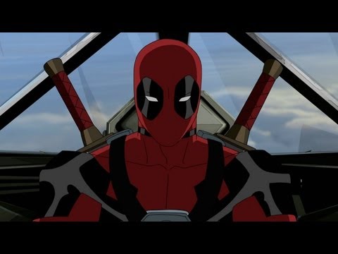
Animated cartoons have many various styles these days that showcases either simple drawings or really detailed drawings, this either tells you that the character is done by professional animators such as characters like deadpool:

Image result for ultimate spider man deadpool
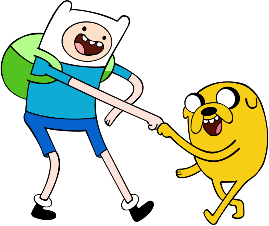
which takes a lot of time to create because of the amount of detail that has been put in to the character and needs someone who has had a lot of experience to animate such a detailed character whereas simple 2D characters such as Finn and Jake:
Image result for finn and jake
would not take to long to create because they are simply made out of simple shapes making the animation process less time consuming and allows the animator to get more done.

Both simple and detailed animations have their potentials and limitations, for example with dead pool he will always need to stay consistent throughout the scenes hes animated and that could limit the amount of squash and stretch the character can do, which also has the potential of looking good having the extra details makes the visuals look interesting, making the character look serious and human like.

On the other hand simple animations have their potentials of making the character squash and stretch because the characters are simple and would not take too long when animating them, for example Jake the dog can shape shift and this can help visually understand that anything is possible to do with Jake. As it is simple, there are limitations as to the movement that happens to the characters on the show,  but this is not as limited as it is with detailed drawings it all depends on the animators who are animating such sequences with their experience.

Wednesday 7 December 2016

potentials & limitations 2

2D animation (digital) vs 3D animation

Both use different techniques to animate something, With 2D animation their are a few techniques used to achieve your final out come which is mostly based on drawing out or producing shapes that tween whereas the techniques are very different when creating a 3D animation you have to undergo a lot of making 3D objects and rigging characters you have made and then move on to animating the character by moving the rig body parts in a 3D space.

Image result for 2D animation
Image result for 3D animation


2D animation does is not as time consuming as 3D in terms of making, this is because the 2D format does not need to go through the process of creating a character with a character rig which is a long process and mainly the longest part of creating a 3D animation, whereas with 2D animation you can quickly sketch out a character and use it for reference when animating in 2D and allows for the animator to get more done within the time it takes to create a 3D character.

Although one potential for 3D animation is that once all the assets such as the character and their environments are made, you can quickly animate the character in the scene and have the ability to move the camera which is quite difficult to do using 2D animation and would be a limitation to the 2D animator to create, only if they did not have the artistic knowledge as to perspective which is still hard to do. And with the ability of having made assets you can reuse them in many scenes which a hand drawn (digital) 2D animation cant really make.

Another potential would be the ability keeping the proportion of the character consistent which is no problem for the already made 3D model whereas with 2D (digital) drawn animation keeping something consistent needs a lot of skill because its been drawn, Although when animating a stretch and squash sequence 2D animation have the ability to have fun with it resulting in a funny motion, This can also be achieved with 3D animation but this takes a while and would be all done in the rigging proces, but if the rig is not done well or correctly it would make it very complicated to animate the stretch and squash, it comes down to animators preference as to what is easier to animate with.

here is a link showcasing the process that 3D animators go through to make a character with a rig, it varies on different programs but it is a similar process and that it takes a while to create where as 2D characters can be a really quick simple process from drawing.

http://www.creativebloq.com/3dw/Georges


Friday 2 December 2016

Potential & Limitations 1

2D traditional vs 2D digital

My chosen medium is digital 2D animation and there are limitations and potentials from using this medium but comparing it to traditional 2D animation there is a lot of work that can be cut off by simply using digital software.

One or rather many limitations of doing traditional 2D animation is that you have to have the equipment for the process such as a light box which is often needed to create animations which helps with seeing the frame before and after so that you can create an in-between and can be sometimes difficult to see frames. With the development of digital animation we can easily adjust the amount of frames we'd like to see and be able to lower the opacity to suit us and with programs such as flash or Clip Studio Paint we can change the colour of the onion skin which is very helpful in identifying the frames behind or in-front to help with making in-between's. and there are many things that the digital format has made to make the animating process easier and less time consuming.

Although one potential of doing it traditionally is having the physical format which is good if the digital format fails because you still have the physical document of frames that have been drawn out but one problem which is resolved by having photocopies of the frames is that you need to look after the frames because they can easily get ruined if not put in folders. This is also sustainable where as if digital crashes you cant really get anything back which is a limitation for digital animators but rarely occurs if you auto save and keep the drive from getting full.

There are many more examples that can showcase the potentials and limitations of both traditional and digital 2D animations but that's up to the artists preference for animating.

here are links to justify the importance of equipment needed for traditional animation:
 http://animation-studio-stuff.blogspot.co.uk/2009/05/purchasing-animation-desk-or-lightbox.html

and here is a link to showcase the differences and how its easier and not as time consuming when animating digitally:
http://animation.about.com/od/faqs/f/faq_companim.htm

Sunday 27 November 2016

weekly 8

moved onto shot three with the phone sequence.

The beginning of week 8 or rather half way through (since i was busy ) i had to move on to my other scenes and from looking at my story board i could see that i had to do the phone sequence which I planned in my head in advance as to what i need to do in order to achieve the effect, started to gather my own references,

The first bit of reference i gathered was the screen text message, i just looked at my phones message app and made something that looks similar, here was the end result:

from this i continued onto animating the typing animation which i referenced from Facebook's typing animation when someone is going to send a message since this sequence needed to showcase the friend sending another message that reveled the title of "last chance" within the message. 

here is a the typing animation which is going to be placed at the bottom left of the screen, this was simple to do because all i did was make one ball move up and down which was done all straight ahead and then copied the animation folder twice and moved it across, 
heres a screen shot of the timeline:


All i had to do was move the key frames so that the circles all started at different moments and the exported it ready for the phone sequence which i will edit into in after effects.

I then recorded myself picking up a phone and bringing it to the screen  as i needed it for reference, which really helped as i only needed to do one frame and tween or rather copied the one frame into the timeline.

here is the recording of the of picking up the phone and my version of the phone being picked up or rather brought into the scene:


Using my own references are very useful because i can showcase some reality into my scenes which can be simplified but still give the effect of being real to the audience.

hopefully by next week i should be able to place the phone screen onto this sequence, one of my friends gave me some advice as to what i should do when placing the screen onto the phone which is to make the screen a 3d object and that should allow me to move it around and fit it to the screen. not much progress so far with only ten seconds of unfinished animation but hopefully should be able to get alot done next week and done by the deadline.


Friday 25 November 2016

Study task 4 DUIK rigging

This study task took a while to do because i put a bit more effort then i should off but this was because i wanted to enjoy using DUIK even though i had some bad experience on my first go but have learned alot from the mistakes i made on to completing this task.

I first made a character that had gaps in between each body part, which made the process of rigging it using DUIK quite difficult because there were to many meshes and to make it even worse i made to many layers which made it not work in the end.
here's a screen shot:

placing the pins on to the body confused the program because each part was an individual layer, One of my friends gave me one important advice when he was helping me, which was that DUIK's purpose was to automatically make the joints to  the character move which means that there was no point in rigging this character because everything was separated and needed to be connected.

This is what happened when i did rig the character at its current state:
all the controllers and bits of the body would move out of place and rotate completely wrong, from the screen shot above. I had to go back and fix this problem because it was the character and not the rigging that was wrong.

i first went back to the characters design and combined specific layers together, for example the arm, forearm and hand on both sides. I ended up with 5 main layers which were head, torso, arms and legs. I also ended up filling in the gaps between each body part so they were on 1 mesh which is important and makes it easier for DUIK to link the bones.

here's the change i made:
I then went back to Rigging this character which i found much easier now that i only had 5 layers and got all the bones i needed and linked all the bones so they joined up and rigged it fairly quickly because i manually joined them, the reason as to why i manually IK'ed each part was because the full body rig took a bit of time and would not work with my rig properly.

I then had to decide what this character was doing and i was inspired by a YouTube video of a guy playing on a xylophone :


And i decided to make my character play the xylophone, so i quickly made his props and got him to hold two sticks. all i had to do was just key frame the character but i had some troubles on the way because the arms would bend really weirdly, i solve this by keeping the arm straight and changing the IK bone direction so that the bend would transition smoothly through each frame, here's a screen shoot of how the arm would bend:

Here is the end result once i finished placing all the key frames.


in the end i would not use DUIK much as it is not the animation style i like and seems like it would be better for funny animations as i found it funny from the result above.

Sunday 20 November 2016

weekly 7

Starting off week 7 I looked into comedy aspects and how it is portrayed through animations, I mainly looked at youtube videos because its what comes to mind when i thought of animated content. There are two youtuber's that both showcased their comedy through black and white drawings that are animated, both have been using the same medium or rather method of animating for a while and recently have started to apply colour but only on certain areas such as the hair which you can see here:


In fact their recent animations feature these black and white sequences ( that includes single colours such as the example above ) 

I liked how they portrayed the characters with a minimalist style which i could possibly do but had not attempted and have already decided on it being semi realistic. Watching some of their animations i could see how they implement comedy through their drawings, at certain points they would over exaggerate the face that looks semi realistic and this would appeal to the audience and they can connect with the narrative more, heres an example of domics and the fear raiser over exaggerated face:


from this research i have decided to keep it black and white and also implement the way they fit comedy in but rather then making the face over exaggerated make it cartoony because my character is already semi realistic and from this the effect would come out more from making her face cartoony.


Made a few amendments on the animation of her head turning but did not get much chance to work on the animation since i was at MAF and i hope to get more work done over the next few weeks and hopefully finish this animation off before the deadline.

Friday 18 November 2016

study task 3 puppet master

Starting this study task of by taking a picture of my friend in a side pose, since i had a thought of making the character jump across an area in the composition i was going to make. i told my friend to stand in a specific pose in order to make it easier to cut him out and be able to place pins appropriately when entering After Effects and using the puppet pin tool.


Opening After Effects up, I imported the cut out picture of my friend and found a simple background online which allows me to animate the character to jump in this space. heres a screen shoot:


Using the puppet tool i placed the points that i want to be able to move and animate the character and made sure the spacing between each point was reasonable which you can see in this screenshot:

After placing each point i wanted to apply the starch pins to the character so that it makes the character have sharp movements rather then wobbly moves, these pins where placed on the legs and arms, because this is where movements are sharp in realistic movements, another screen shot:

I learned that you can control how much you want it to bend and appear sharp which i applied in the above screenshot, I soon then realized that coming to the animating the legs where overlapping which i solved using the overlapping pins. From that i managed to choose and select the amount of area in that the arm and leg gets in front of the body which was quite easy to control and could be very useful if i ever come to using the puppet tool. screen shot:

i then moved on to animating this fully pin rigged character and placing the character in key frames was quite easy to do but then i came across a small problem when animating, which made the arms and legs look weird and was quite hard to understand what was making it bend awkwardly, but i manged to cover it by using the other leg heres a screenshot:

Heres the final animation

In the end, the result of using the puppet tool made it easier to animate a character but id only use this when i need to move simple objects on the screen without needing to create new poses/animated sequences. Alan Becker showcases how he used the puppet tool in his Animation vs animator 4 animation where he cuts out the hands he recorded and uses the puppet tool to make a smooth transition. heres a short clip of Alan showcasing the puppet tool: (go to 1:10 )


Tuesday 15 November 2016

ppp collaboration

Throughout this session, we were asked to attended, I found it very interesting that i thought i would talking about what we did.

We were asked to go to different departments where we were mixed up with different students from graphic design and illustration. the session started with mixing all of us students randomly. from this, we were asked to team up with the person next to us and come up with a word using our surname and we ended up with Sausage Rain in my team. Then we were asked to think up ideas to what kind of product our title we came up with would be.

So as a team of two we were coming up with simple ideas that ended up becoming all sorts of products. from this, we had to pick one idea and pitch it to the class. After pitching we were to vote who had the best ideas in the class and that the selected teams were going to lead the next task. We were chosen as one of the selected teams as our idea was picked by many teams in the class.

The next task was for the teams that didn't get selected to team up with the leading teams, from this we were to improve our idea, Many new ideas aroused from the people who joined and we began making the original idea even better. We ended up having to pitch our new idea to the class again with our newly formed team and from this we were to decide which team had the best idea. unfortunately, even though our idea gained votes we did not win the majority of votes.

We then were assigned as a class to work on this idea to produce a small advert for the idea that won, which i wish was our team but none the less we started forming new ideas and split up into small teams to create different props for our product. we created the advert really quickly as we did not have much time left. and were to showcase it in the theatre where all the second years were present.

There were three groups including ours that were presenting their ideas for the product they made in their session. We all viewed each advert and were to chose which group had the best advert, unfortunately, our group did not win but that is not really the point of this whole session.

What i experience in this session opened my thought process as to the possibilities that come from teaming up with others and from such a simple system that gave us a way not only to communicate as to what we can do with an idea but to also make it better by involving more people.

This is what must be going on in big companies that have teams of animation, graphic designers and illustrators working on producing products, which is why collaboration is important and why us creatives should work together.

Sunday 13 November 2016

Weekly 6

Starting this week i decided over the weekend that the backgrounds were taking to long and that the colours were not working well from what i see, which was distracting me from the main task of starting the animation, looking at the amount of angles i have to work on will take to long and will decease the amount of time i will have on animating the character which is the main focus of this brief.

I want to concentrate on clearly portraying her feeling in the scene, which is how i'm going to showcase the narrative, i'll be doing this by looking at reference images of expressions and how they are animated or rather how people (actors) express emotions from films. the emotion that I want to express the most is anger is she starts losing her patients waiting for the bus.

With how things are going from making this new decision to not colour in the backgrounds but rather get on with starting the animation i have already manged to get 6 seconds of draft animation done which is a good start but i want to get most of the draft animation done as quickly as possible so that i could move on to lining the frames and colouring the character in, if i have time i will go back and colour the background in.

heres the first 6 seconds of draft animation showcasing a quick pan to the right then zooming on to the character off her looking around and then getting a message which i am still yet to draft animate it :

this gif does not include the first three second pan to the right because there is not much movement, so this is showing the next three seconds of her moving her head to check her surroundings and hopefully getting a text message.


Sunday 6 November 2016

weekly 5

Starting the week i got on to designing and colouring the backgrounds for my animation, whilst drawing with flat colours i thought about what i can add to the scene and how i could use the assets for other angles (7 different angles).  from looking at what I've created it just did not look right and was taking to long to make backgrounds which i'm starting to think of an alternative way to make the backgrounds work with the character.

here is an example of the flat background iv'e made so far:


I've been influenced by the colours from the photographs i took by colour picking and changing the saturation to make the colours brighter and blend well with the colour palette for my main character, i hope by next week i would have made a conclusion as to what i want to do for my background.

I've also have made a new character design sheet which now showcases that my character is an artist ready with her bags to go to an art convention to sell her art. The reason as to why i gave her a casual look and is holding loads of things such as bags is to show, its to showcase that shes a mature adult. heres the character design sheet


here's the finished character design, as you can see the character looks older with casual clothes and she looks like a creative character which is what i wanted to portray. On the right of the character design is the colour pallet which i thought about carefully an stuck with tertiary colours which fits warm and cold colours together.

hope to start animating by next week and have enough time to create a draft animation which i can line and colour which im looking forward to, so that i can concentrate on the character's narrative. I mostly want to focus on my main characters expressions so that the viewer can feel the emotions going through her situation of missing the bus without having any dialogue.

------- Artist research 365 day's of sketching by Atey Ghailin

This book is very inspirational when i found out about it from one of my friends, the artist challenged himself to draw within 2 hours everyday for a year; this was to try practicing story telling as said in his sketchbook, this was because hes a professional game artist working at Riot games. this intrigued me when first reading about it and then i looked at his concept drawings and i could not believe that the artist was able to draw such amazing concept art within two hours which he explains throughout the book by tutorials.

One of the main interests in this book is the way he uses colours in that he has a main colour which is apparent and then is able to use other colours that work, which i want to understand for this project. The reason as to why colour is important for this project is to figure out what colours work together and is pleasing to the eye, heres an example :

If i could understand how Atey or rather how colours work together, i would be able to make my backgrounds and characters fit well in a composition which is what i want to achieve with this project from finding out about this book, it has inspired me to experiment more with hard brushes rather then the air brushy soft brushes that i like to use for most of my compositions. 

I hope i could get the understanding whilst experimenting and looking more into Atey's drawings through his sketch book and socials websites which he highlights at the front of the book after the first page.

Here's the book cover and some of my favorite pieces which has inspired the colour choice i have gone with for my project:


I've also looked at the way his lighting works in these images which has given me a develop understanding which i hope to showcase in the animation, lighting is very important and i want to hopefully get the right lighting to give depth to the character in the scene which I'm animating. 


Sunday 30 October 2016

Weekly 4

Too start the week with a presentation as to how far I am in the project was quite nice to receive all this feedback from the class as to what i should do about my character design, and this has helped me in improving the character design for the final result which is this picture below of the characters face style.


I made an anamatic from the storyboard which i may need to further define and start animating on since i'm going to fall behind if i don't soon, the timing is ok and fits within 30 seconds which i hope i could produce!


To finish the week of i made a line art which i hope to colour next week of my new character design which is hopefully the final version, so that i can start animating and getting on with the process of making the backgrounds and bus stop design. I will also need to place my refined storyboard on to the A3 storyboard page and final character design on the the A3 page to finalize the whole process of post production.