Monday 28 December 2015

Process and production: class crit

I presented my idea about "The other side" animation to the class, which i presented in without a presentation; instead i showed everything that ive researched and what i have currently done at the moment. This included my influences towards my project and my stories i prepared for the other side but did not use because i didn't think they were suited to the characters, my characters were heavily influenced by my favorite animation Mike Inel which gave the impression that i was just recreating his animation "Draw with me" with a different story, and at the end of the crit i decided by the feed back given to change the character design  which is shown below:

I also decided that this animation will take place in a city instead of an empty space, i changed everything i could in order to showcase something different to Mike Inel's animation and make it my own animation with my own style of characters.  

Thursday 10 December 2015

visual language - character design (part 2)

heres some more experimenting:

Ive started to think of how my character looked like in terms of body proportions, for example one approach i went through was making him really tall with stick type legs because it would suit the job hes currently doing which i mentioned in his occupation on the first character design blog. He is a servent, which gives me the impression that he is tall and slim and wears a suit.

here are some poses of him in the drawing below:

As you can see ive thought about how to assemble him from simple shapes using a rectanglur top and a triangle bottom, in the bottom drawing you can see how i started to experiment more with his poses, for example how his legs bend and how he should stand in side view.


Visual language - character design

At the start of the brief we were told to make a character which had to explain everything about the character, for example his name age and occupation.


Then we had to make them out of various shapes which was a funny process of just experimenting and making wired exaggerated bodies,made of circles, rectangles and trianles to fit the characters personality.
Theses are the examples i did above which showcase the body types and how to make a character so exaggerated with various shapes to make body parts. I started to make all sorts ofweird shaped characters which did not resemble the ideals of the character i wanted to make, but it allowed me to experiment with making various intresrting characters.

Saturday 28 November 2015

Process and production: thumb nailing and character sheets

Here were the ideas i had thought of before making any thumbnails, as you can see here i started just sketching how the characters would look like on the first picture. 
As you can see i had a few ideas of what kind of hair style to make and potentially clothes they would be wearing but, thinking about how i can animate the clothes stop me from choosing this design as it would be difficult to do. 

In this picture i was thinking about "Draw with me" character and also what kind of personalities they had, which helped with the ideas i did on the right side of the image of a boy trying to save a girl from the other side of a bridge. This idea felt generic and i didnt like it so i stopped thinking about it. 

I then moved on to making the story plot and ideas on this image, as you can see the girl stuck in her own bubble unable to escape and a boy coming to come and help her in the situation. i stuck to this plan because i really liked the idea and i knew i could make this animation, the second i started with the thumbnails all the camera angles have just entered my head and i found it easy to make the thumbnail sketches; here s the end result.

Ive been working on the story board and have come up with a way where my two character interact with each other within the 25sec time limit and I've also made an anamatic, which i can showcase. showing the thumbnail storyboard above.

heres the anamatic

i started to develop some character design sheets, which were inspired by many different drawings from my pinterest account and mainly Mike Inel's chracters. I found a post by Mike Inel showcasing how he developed his animation which is pretty long and discuss what ideas he had when he was making the animation and also what methods he used to make the characters move, heres's a link

here's is an example of the girl character sheet, which showcase the colours and expressions i will be using in the animation and also to help me get a feel of how the character acts at different angles.


process and production: start of project


We got told to make a narrative with the title "The Other side" and as i was making the plot many ideas came to mind, onre idea that came into mind is for a boy character to help a girl character to get to the other side of the world they are in which sparked up more ideas. For example i though about videos/animations I've previously watched which showcase the other side. One of the animations which i remember was done by one of my favorite animator, which was called "draw with me". The story that takes place in this animation is about a girl and boy that are separated by a glass barrier, and what is shown is both characters are drawing on the glass to communicate to each other. Its a nice story that takes a drastic plot twist near the end, I like the idea of thier being some kind of barrier between two characters so i developed the idea of one of my characters being stuck in her own sad bubble.

I had to think of some kind of way to bring the characters together and show "the other side" when i was thumb nailing my story. In the process of making the thumb nail sketches i researched for inspiration of colours i would use and what kind of styles fit the scene in my own particular style. here are a few pinterest boards i made:

This showcases characters in different environments which i found interesting and would like to develop the story based of these different colours and scenes.

Here, in this town...spring...the blue sky...sakura...a black cat...and she...A beautiful picture:

This image, sparked my ideas to showcase a girl lost in the forest and then reaching the other side which was a beautiful landscape. I liked this idea and i did expand ideas of what landscapes to do which you can see with this link , but I wanted interaction between two characters so i did not use this idea when it came to thumb nailing. I continue to research more and this is only the beginning of this brief.

Monday 9 November 2015

Explore- flipbook tests

flipbook tests 
this is the first try at making a flipbook which was ok except for the fact that it went in a zig zag bounce instead of an arc bounce, but i still portrayed squash and stretch. 

i had another attempt at making a ball bounce with an overlapping effect and this time it seemed to work which i was proud of, and i think i did really well to make it. 

this last attempt was just to make the bounce more interesting and fun, i made the ball fall in water then comes out as a fish. which works really well and im also proud of this, i enjoyed making these flipbooks and i am sure i will be making more soon in future projects

Identify - Stick Figure Spotlight 4 - Final Eclipse


This animation done by a famous niche animator called hyun made this animation for a game called League of Legends, whats special about this is that each character is portrayed by a stickman and each skill that is used in the game done by each character is done really well to say that it is all straight on animation of stickmen fighting each other, the animation was made in flash which explains why each stick figure looks like a vector. i love this animation style and i have experienced making some stickmen fight and its very difficult to animate them  combating.

Identify- The doll and the rose


This animation was done by my best friend and its a simple animation which showcases a boy buying a gift for his mother that was in an accident and shes on her last moments before she dies to see her daughter who died in the accident. this is very emotional and i cant understand how my friend was able to make this animation because the music he chose works perfectly with what happens.

This animation has inspired me a lot and i wish i could make something as emotional as this so that i can grab the audience attention and also for the audience to connect with the characters and feel the emotion of the characters.

Identify- 007 spectre


007 is one of my favorite action films because its about a spy that goes round spying on people and has cool gadgets which help in on each mission he goes to, his character is played by Daniel Craig who suits the role for James bond. Ive watched all of the new 007 and recently i went to watch Specter which was interesting and amazing throughout the film, following the life Of James bond till the very end. the scene that attracted me the most was the very beginning where it starts off in a death parade in Mexico, the reason i love it is because of the single 5 min cut which is very hard to achieve especially when  there is a lot going on in this scene, timing is very important and id like to achieve something like this if i make a single cut scene.     

Apply- story board and final animation

To respond to the whole studio brief we had to make an animation using all the techniques we used through the explore brief, the theme i chose to reply with is love and i made the most simplest scenario that could think of where a boy meets a girl and says "i love you" and where she replies with "I love you too.." here is the storyboard:

As you can see i had thought about how to make the characters interact, but this ended up being too long for a 10 second animation so i had to takes some scenes out, i took out scene 3,4,5 and connected 1,2,6,7,8 which makes it more mysterious to who she replies to and makes it less to work with. and i also thought about character design underneath which was a simple sailor uniform used in Japanese schools based on general animes i've watched. i then produced an anamatic of the storyboard here link form and here is the character design

Once i finished the animated storyboard i made on flash cc, I continued to the final line out which took a long time because of the walk cycle which i did not anticipate and also i had to make a few changes to make it run smooth and there is enough time for each scene. here is the final animation:

im happy with the final result and i believe i responded to the brief and theme, if i were to do it again i would look at more references for a walk cycle and clothes movement. i found it very difficult to do the walk scene and i kept on undoing many lines i drew jut so it look right, but besides that it came out the way i wanted


Identify- fast and furious 7


The fast and Furious franchise is probably one of the best action films in my opinion because of how the narrative and characters keep you attract you to pay attention to everything that happens within each film. The basic story line is people who are racers that go through many different chases or robberies in these amazing action scenes. There are many things that happen which changes many of the characters, and everyone starts to work together to stop things from happening.

Watching each film i gain a lot of inspiration because of each race scene or action scene that happens because thats what makes it interesting to watch  and keeps you watching, When i went to watch Fast and Furious 7 no one moved out of their chairs for the full film because of how amazing it is and i want to make something that takes all your attention to watch the whole sequence without moving.

identify - Looney tunes show

The Looney tunes show is a new version of the original Looney tunes, i love this show because each episode is about Bugs Bunny and Daffy Duck. Every episode starts of with Daffy duck having trouble with things that happen which he does not understand and asks bugs for help, since everyone one knows about the characters you can tell whats going to happen throughout the episode. the recent episode i watched was Daffy Duck is entering a bowling competition without the help of bugs bunny and as he trains with his team an accident caused by Daffy left with Porky Pig sent to the hospital. Daffy then goes towards bugs and asks him to play which he accepts and the tournament begins, throughout the whole sequence seeing each character take their turns, Bugs gets strikes every turn and Daffy gets around 4-5 pins. Near the end Daffys team are neck on neck with another team, to win they only needed to hit 2 pins which bugs could of easily done but Daffy Duck insist on taking a throw and ends up missing all the pins which ends up losing the tournament in the end.

The show was animated all in 2D with a more vector feel rather then the classic pixel feel, I love how its so easy to connect to each character because their personality is well know to the audience and i would like to produce something similar using a vector style for a project in the future

Identify- cowboy bepbop


cowboy bebop is one of the many inspirations of mine because of the narrative and the animation style, firstly the narrative is about bounty hunters traveling galaxies to find criminals. the animation style is slightly different from modern styles because it was made in the 90's and the scenery has a futuristic dystopia look. what i love about this the most is that the action scenes are just amazing to watch and each character is easy to connect to, which is why i watched every episode.

i want to make some similar actions scenes like cowboy bebop because of the intensity and how amazing it looks, the way i would create it is to record some fights and plan a birds eye view map of the area where each bit of the fight is going to be placed which then is easy to plan which camera angles to use to make it more interesting.

My Pixilation

and here is the pixilation:
i think the pixilation came out how id expected it to be since i followed my story board all the way through, there were some mistakes that occurred but besides that i think for a first attempt at pixilation it turned out great and i portrayed what was needed for this brief. next time i attempt this i would make sure i add more scenes and characters to make it a challenge to finish it with many things happening at once.

Sunday 8 November 2015

bouncing ball

I had to animate a ball bouncing in photoshop, here is the result of it bouncing using the principles of stretch and squash  and momentum which i think i achieved with this animated gif underneath
I learned that it is easier and quicker to make a ball bounce on photoshop then on traditional paper (flipbook animation) because first i have tools such as onion skin which allow me to see the frames underneath and above of the current frame, also i have the ability to move the ball to where i please because of the transform tool which is really handy.

I prefer animating digitally because it is easier to rub out mistakes and quicker to finish animations within 10 minutes rather then more than an 30 minutes which takes a while to do on paper, 

pixilation storyboard

The theme for my story board was lost and found, this was a hard theme to go by because there could be many ways to go about this. In the end i thought of money flying away which then came to an idea which shows the main protagonist losing his money as he goes to get a drink of water. and then the money gets picked up by a friend who is coming by. This all portrays the theme lost and found.

here is the story board for the pixilation:
each scene shows different camera angles which are easy to follow, like i said before this is how the sequence is going to happen.

Identify- big hero 6

I watched big hero 6 the other day and enjoyed the story and animation. Its about a boy who invents things, the narrative goes through the standard equilibrium to a disequilibrium to a new equilibrium. this method is used a lot in Disney films, To capture the audience's attention. So the main story is this boy enters a live show to show off his new invention which is a head devices that controls mini robots that can do anything you think of, this then gets stolen by a man who wants to destroy the world. throughout this film the main boy character meets his brothers friends and his brothers robot which help to stop this man from destroying everything.

What i love about this animation is how we connect with these characters as they develop together to become stronger, the 3D animation is very smooth and natural because of each characters movement they are all unique and id like to learn how to produce a similar character that moves naturally.   

Identify - move (Domics)

Domics is one of my favourite animators, he makes many short animations which talk about things that occur in his perspective in his life for example the video above showcases "Move" as in move out of the way, i love this simple and easy style made in flash using the vector tools. Whats amazing about this animation is its all synced to his voice which is not easy to achieve, through out this animation we see various scenes that show situations where you want the person in front of you to move, for example the main one he talks about is people in crowds that just stop to talk to each other which block peoples pathways. I just love how much he stresses about it and then the expression made on his characters are so simple yet amazing, id like to try out this style when i can.  

identify- Control Bear short animation film [ WONDER GARDEN ]


Control bear is a short animation done by the same animation company who also made another animation i talked about in the previous post, the animation starts off with a girl protagonist who walks by a shop window where a toy bear is sat; within a few seconds the bear starts moving around and interacting with the girl and then switches the girls clothes with the clothes on the stand next to him. After a few seconds the bear preforms some kind of magic which takes the girl to a different world with him, which then showcases a world of toy bears traveling towards what is seen as a glass barrier to another world. the main protagonists (toy bear and girl) are amongst all of these toy bears, a broken toy bear machine which is 100x bigger then the normal toy bear tries to break through the barrier. Which then showcases another world in the future where people dont have necks,

I love this animation because of the narrative, how it takes you through an imaginary world of the girl protagonist. I would like to make a similar concept where I create a character that has an amazing imagination which we view through their perspective.

Identify- Noitamina Poulette's Chair


 Noitamina Poulette's chair is a story about a girls journey through life growing up with a magical chair that moves and plays with the girl. this story showcases how the girl has no friends to play with at first and then the chair decides to take her to some children in the local area which she instantly becomes friends with, then time passes by as she grows up with the chair doing things day by day as a times lapse sequence. it then moves on to show the girls family leaving the country side and moving to the city in a carrier truck (and the chair is tied onto) , the story carries on showcasing the girl moving into a new area and a new school where no nobody befriends the her. As she sits in her room alone, the chair on its own will moves and takes the girl on a trip through the city which we get a reminder of her past at the country side.

this part of the animation is probably the best because we get to witness the impossible but possible in the animation world, of the chair moving through the city throwing the girl all about and suddenly arriving at the school falling through a tree which the girl and chair land under. This then ends with a comedic ending where the chair's leg snaps off again.

I love this whole animation and how it has influenced me in so many ways. the way they were able to produce a narrative which is simple and make it interesting by adding an element which can help the protagonist with its life, i wish to make something which is simple but has a really interesting narrative to it.

Identify- draw with me (Mike inel)


Draw with me is one of the most emotional short animations that inspired me in many ways, this animation is about 2 protagonists who are not able to be together because of a glass wall in-between them as you can see in the image above. through out the animation both characters try to interact with each other using drawing as a way to have a conversation since they both cant hear each other. after watching both characters draw on the glass the boy is fed up with not being able to be on the girls side, he gets up and punches the glass until it breaks which ends up in a nasty situation. (continuing will ruin the whole point of the animation, just watch and you will understand)

i love how the characters are simple and the style chosen for this particular animation which is manga/anime in its own unique way, The animator has emotional connected the audience with the characters which is very hard to achieve and is one of the ways i want to produce my animated shorts,  If i can produces and improve on making a character which the audience can connect to, i will have achieved one of my goals

Saturday 7 November 2015

Identify - Nihonbashi Koukashita ( one of the animators, BahiJD)

This time i found a animated sequence done by BahiJD who is single hard working animator, he has produce many animated sequences which are all amazing in such a way. Many of his animations are made either on flash or on photoshop.  Most of the scenes portray strong momentum with amazing  momentum, for example the animated storyboard sequence below showcases a girl spinning around which is so smooth, its amazing how each element moves so well; for example the hair and clothes move so freely as she spins.


S1 -animation作画:  Bahi JD
 (アニメーションMV)  IA x JIN | WORLDCALLING 監督: murakumo × kubotabee

I really want to learn how to make my characters move so naturally like BahiJD does in this scene, the balance and the spin work really well which makes it naturally smooth, by observing this i can see how he controls the energy of the hair and the clothes that has creases.   

 
Nihonbashi Koukashita R Keikaku from Takuya Hosogane on Vimeo.
 This animation is created for a music video and i love how they portray the main protagonist in different scenes, for example the scene where she hits the bottle with the stone is done really well  as in the balance and the proportion. The full video influences me to animate similar scene with similar angles, the way they give a narrative to the main protagonist is something i want to research into and learn how to produce a good story/narrative.

Sunday 1 November 2015

12 Principles of animation


1. squash and stretch
this first principle is very important for animation because it helps convey a action, for example a ball dropping and bouncing on the ground. how this works is the ball drops in its normal state and as it gets faster the ball starts to stretch, when it hits the ground it will squash; all the energy of the ball hits the ground and as it bounces half of its energy has gone and this leaves the ball to get back to its normal state. heres an example:

i made this example using flash, this shows how stretch and squash work in a ball sequence test.
2. anticipation
this principle involves moments that convey an action before making that action which is preparation before we do, for example a pitcher is about to throw a ball he swings the ball back which is the anticipation and then throws the ball which is the action. here is an example:

3. staging
staging is where you compose a scene with elements such as characters and objects, this basically exaplains mise en scene where a scene consists of different objects. the main purpose of staging is getting the composition right to tell a story between characters. here is an example:

4. straight ahead animation 
straight ahead animation is not using key frames and trying to animate a character or an object in a scene, for example a straight ahead animation would work in scenarios where a character is doing something which is not staged, something like catching a ball. the character could be animated in many ways whilst catching a ball this gives the freedom of straight ahead animation because you don't need to stay in strict key frames (pose to pose) which allows you to play with the characters animation. in the end using both key frames and and straight on work so well sometimes. here is an example: 
「アニメーションらくがき」
rough animation/  sKILLupper x Maltine records,2014/10/11 @ 2.5D http://skillupper.net/star/
Live stream: http://www.ustream.tv/channel/2-5d1
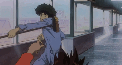
5.follow through and overlapping 
follow through is making or knowing that not everything stops in a sequence, for example if a character is running then suddenly stops, this mostly happens with long haired characters the hair will continue overlapping the character face as they stop, this is because of momentum of the hair as the character suddenly stops. here is an example:
C37- animation作画:  Bahi JD バヒMy animation works for Koji Morimoto's 『A Better Tomorrow 』scene.
                                         
6.ease in and out
Everything that moves has momentum and easing in and out is apart of that momentum, for example when an object is moving it starts slowly which is the ease effect for example a man walking its starts of by easing in and as it gets quicker which is easing out. here is an example of a man holding a broom:
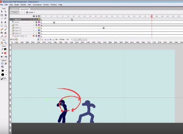
     cowboy bebop animated GIF
7. arcs flow
in order to keep the momentum of an object it needs to have arcs or some type of flow, for example when a ball bounces, it bounces in arcs not in straight lines up and down or a zig zag motion because that looks unnatural you can see this in the example i made above in the squash and stretch sequences, as you can see it moves in arcs. here is another example showing how to keep something in a flow, as you can see by the red line it shows the punch flow/momentum. 
8.secondary action
this occurs when an object makes another do something, for this example the main character receives his bill, this ends up getting him shocked which then portrays the secondary action which is his eyes popping out and getting bigger at the bill he has to pay. this is helpful in may ways to produce a comedic effect and empathizes on a particular expression or movement. here is an example:
                                         
as you ca see she is upset by something she is looking at which makes her give that expression which is the secondary action. 

9.timing 
knowing how to time objects in a scene takes a lot of patients and practice, to get an animation which flows and works with the timings needed is hard, how timing works is calculating how pose to pose will work for how long, for example a pendulum loop for 2 seconds at 12 fps can be easily calculated, this can be done by having 12 frames do one full swing, within that swing u can measure the momentum for the pendulum to get to the other side and also put key frames which allow you to see which point the pendulum is at, this will make a smooth transition for the pendulum. all this is to do with timing with frames. if this animation was done at 24 fps you would have to double frame which is making a duplicate of the frame you just made. here is an example:


10. exaggeration
exaggerating an object helps portray single moments of a scene, using both fast and slow movement can convey many things which allow the audience to connect to the character, slow and fast movements have different benefits for example slow movement such as moving the eyes of the characters to look the other way is effective because we understand the situation the character is in depending on the scene. its the same with fast movement depending on the scene. here is an example:


11.solid drawing
to give life to any animated object you will have to give the object volume, weight and depth this is done by the movement made by the character or how it acts if its an object. with solid drawings you can portray anything and it will feel natural/realistic when it is viewed although it is a illusion. here is an example:
                 『坂道のアポロン』話数#7 に原画マンとして参加させてもらっています。( ゚▽゚) Found these gifs from my animation work on  "Kids on the Slope" episode 7.作画: Bahi JD (『坂道のアポロン』話数#7)These are the 3 cuts that I fully worked on as animator & layout artist. There are 6 other cuts where I only drew the layouts/backgrounds. 

12. appeal or character personality 
allowing to give  connection between the character and the audience is important so that the audience can connect their feelings with the characters feeling. being able to make a character to such a degree which connects to the audience is hard to achieve, the character has to have a solid personality that everyone loves. here is an example of a character:
                                               
mickey mouse is the best prime example for character personality because everyone loves his personality

Friday 23 October 2015

pendulum animation study task


the brief was to create a pendulum effect using animation paper and place holder in order to keep all the frames in order, so that the play back for the animation works with the object staying in place. As for producing 25 frames of a pendulum swinging for 2 seconds at 12fps (frames per second) was a nice easy task, all i did was place the key frames which were frames 1,6,13,19,25 these frames were basically the begining, middle and end of the first swing then back with the same middle and end.

withing this test i learned how to control the speed of the pendulum by understanding momentumn of the pendulum, this was helpful because i was able to make a smooth pendulum swing loop as the example shows above. One problem that occoured when making this animation was when i got to frame 13 i continued with a straight on animation which turened out to look wrong and i had to redo all the frames above 13 using key frames. Ive learned that it is important most of the time to place keyframes to help give an understanding of how far each pose is and you can mesure how far apart each frame needs to be.

overall i loved end result of this animation and i hope i can keep on improving as i produce more tradtional animations. i beleive the most important part of this task was making sure the momentum of the pendulum was correct as it hit each key frame i made.


Tuesday 13 October 2015

Storyboard Analysis 1

The anime Samurai Champloo had some interesting scenes, and the storyboards made by the studio really indicate the key moments which are memorable. What i like about this storyboard is the fact that we have a really good look at the expressions the characters are giving, in this case the main protagonist is challenging another character and the tension is shown just by his scared expression as he dodges the attack towards the close up camera, in this still frame.


 I'd like to be able to make expressions similar to this so that the audience I'm appealing to can understand and have similar feelings to the character they are watching.

my storyboards (nursary rhymes)

For our first brief we were tasked to make a full rendered storyboard for a nursery rhyme. in order to create it we had to undergo many processes which include making a paper edit, thumbnail sketches and character design.

To begin with i created a simple paper edit which showcases the scenes for Hickory Dickory Dock. When producing these scene i had to think carefully about the camera angles so that i can tell the story and its easy to read for the viewers and understandably visually, also with each frame i thought about what is necessary withing the scene so that there is a sense of depth and perspective which i can work with. for example the the 2nd scene where we can see the under shot of the mouse looking up at the clock shows how big the clock is from the mouse's point of view.  


the paper edit scenes
  1. The establishing shoot of the scene, this is so we can get an understanding of the surrounding.
  2. This is a low angle shot showcasing the protagonist looking up at the clock.
  3. Over the head shot of the protagonist showing their scared but interested face.
  4. A Birds eye view of the protagonist climbing the clock, with this angle i can showcase how difficult it is for the mouse to climb the clock.
  5. Medium shot of the clock ringing, the reason behind this shot is to show the clock shaking.
  6. Over the head close up of the mouse being scared by the noise.
  7. A far shot which zooms in to the protagonist.
  8. Close up at a low angle so that we can understand the height they are at.
  9. still a low angle shot of the protagonist going down the clock.
  10. To showcase the perspective of the protagonist i did a birds eye view which shows the mouse climbing down the clock.
  11. side view angles of the protagonist running away from the clock, keeping n mind the sense of direction making it easy to understand where the mouse is running towards.
  12. side view angle as we ease in as the mouse runs off to the left.
notes towards making these paper edits, i made sure i used rule of thirds in each scene so that i can tell whether the composition works or not; this is important because each scene needs to make sense with direction in order to make it easy to read/view

After creating this paper edit storyboard, i planned on creating a character. the character design process was fun to create, i particularly enjoyed making the expression of my character. For example one expression shown is shocked, which i believe i executed well. I've learned a lot about making these expression, to make them i pulled faces and try to produce my own representation of the faces. This also gave me an understanding of the visual element of the face. The reason behind making the character a female was to challenge myself to see if i can make a human body move when it comes to animating. 


I made a few different designs of hair and clothes and deiced that the long dress was best for this simple design, i did not intend on making her look complicated since this would make animating her difficult. most of all i just love the simple design in general. 

Once i decided which design was best for the sequence I then moved on to the thumbnail sketches of the paper edit which were more rendered then the paper edit, and easy to understand each scene. As i was doing each thumbnail i found it difficult to keep the proportions correct at different angles, for example the scene where she is climbing up the clock was very hard because the closer she is the bigger she looks (as you look at her arm as it reaches and goes of the camera zone)


After producing this storyboard I went on to creating the full rendered storyboard which was created on a digital format, the reason for making it a digital format was because its easier to undo mistakes and also i have layers that i can work with to produce depth within the scenes shading in grey scale.
line-arting every sketch i produce took a lot of effort because i kept undoing many of the lines, and this was very time consuming. Ive learned that i need to improve my line arting and be able to line quicker with fewer mistakes.

This is the final rendered storyboards which showcase the full nursery rhyme, when creating each scene I traced over the thumbnail sketches and added more detail, details such as grey shadows and lineart in general. throughout making the full rendered storyboard i did encounter some problems which i then resolved, some of which were how i could change the brush in order to work for me so that i can get the right pressure in order to do the lineart and grey-scale.

  in the end i learned many things which should help me when producing storyboards in the future, and hopefully i will be able to think off better ways to improve the storyboard and the time it took to make the full story board.